Renovation of the De La Jeune Lune Theatre
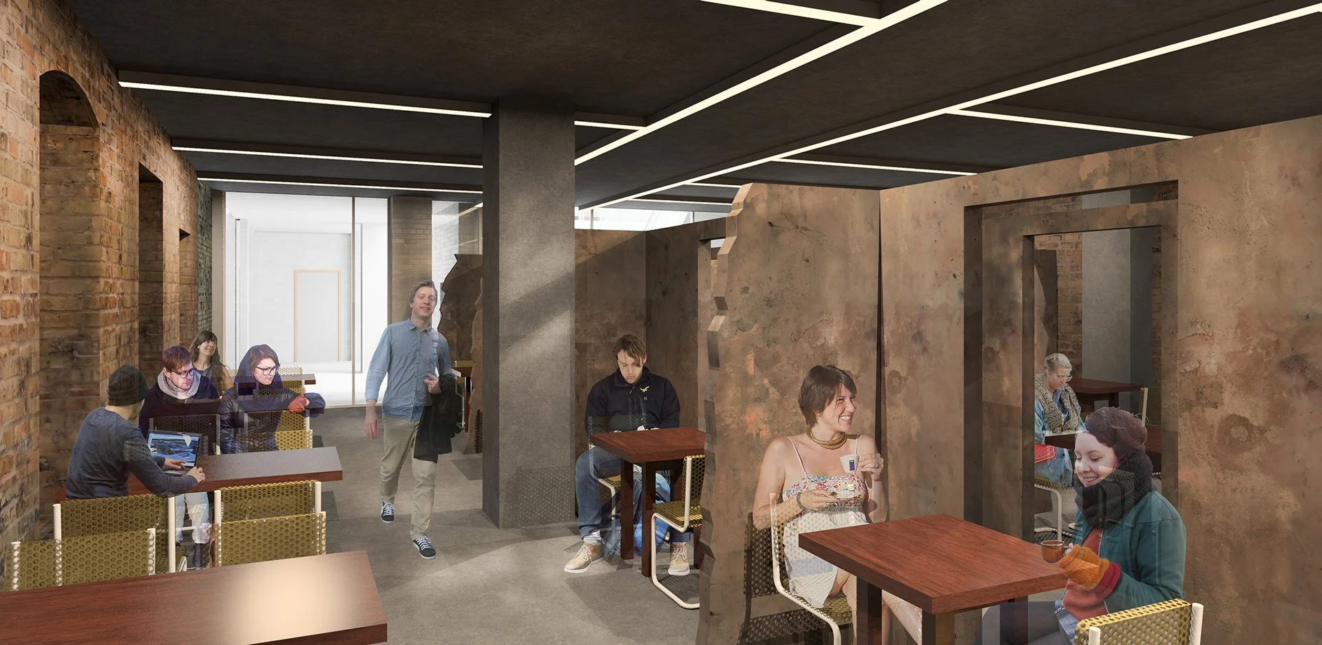
Dining Area under White Box
Protected Historic Facade
Existing Basement
Existing Office
Assignment
The building at 100 1st Avenue North has a very rich history. It has been renovated many times. It has gone from a warehouse to an office, from an office to a theater, etc. Each stage had left a mark and made the layout very complicated. The spaces within have limited access to sunlight. Cutting additional windows is not allowed in the street facades because they are protected by the National Register of Historic Places.
The current owner cut windows in the unprotected facade and turned the adjacent spaces into the offices. The former theater space is used as a rentable entertainment venue for occasional conventions, parties, and weddings. Meanwhile, all other spaces (the majority of the building) were deemed dark and unwelcoming and left unoccupied, serving as long storage.
The assignment was to come up with a program that would make the entire building inhabitable while complying with many spacial and legal restrictions.
Existing Lobby
Former Theater Space - current state
Existing Safe Storage
Design Strategy
When I toured the building, I realized that darkness there is not a problem to fix - rather an asset to enhance. In a way, darkness is a part of the building’s history and it should be treated as such. While I cut multiple skylights and paired them with light reflectors, I did so sparingly, to create the drama and contrast between light and darkness.
The play of light and darkness is mirrored in the play of new and old. On the diagram, black stands for the historical parts of the building and for new structures that blend with its history. White represents altered historic materials and new elements that boldly stand out.
Where the intervention of the light and the new happens, the historic brick is painted white to carry the light deeper into the building. The material palette of such places is bright. Meanwhile, the historic darkness is preserved in the rest of the building, and the limited interventions are done with darker materials. This creates a stark boundary between old and new, and at the same time keeps them closely linked with the brick’s texture and light. After all, you cannot appreciate light without darkness and new without old.
Light and darkness, new and historic.
Program
The intriguing feature of the building is that not a single part of its history is totally gone: traces of history are everywhere. I wanted to recognize all the historic portions of the buildings and pick a concept that would tie them all together and allow different kinds of activities to coexist under one roof. This variety of historic conditions deserves the same variety of different programs.
I think that the best program is a community center. It will become a place where people gather and create clubs to do different kinds of activities together. A successful community center is a place of attraction for the entire neighborhood. People can join the existing clubs there or even rent a space and create their own club. Various clubs can create rather unexpected chains of collaboration while working on something together: from an art installation to an experimental dining event.
Dining area
Lobby
Big Event Space
Art Club
Level 1 Plan
Spatial Organization
The ex-theater space is now the Big Event Space (1.). It is a great example of restoration work that I chose to preserve mostly intact. It can still be used for a variety of big events, from conventions to plays.
Close to the Big Event Space is the double-story Event Support Space (2.) with a rehearsal stage. From here, there is easy access to the Black Box (3.) which sets up a perfect environment for producing and rehearsing music.
The basement houses heavy-duty and noisy programs, such as the Sports Club and workshops equipped with industrial machinery that I call the Heavy Craft Club. There is also another double-story program that starts in the basement. It is a Store (4.) where various products produced in the clubs can be sold.
Spaces
The entire second floor is a food venue. There are two dining areas and they both are visually connected to the Big Event Space. This connection allows them to be used as a VIP lounge on an event day. The dining area is located in the safe storage units. There used to be a corridor with safes on both sides. I decided to cut two additional corridors parallel to the existing one right through the safe storage and then put tables into the remaining structures (the safe storage is partially saved in the Art Club and the Small Craft Club as well). I also reduced the height of the storage walls to make the environment friendlier. Light fixtures on the ceiling echo the original pattern of the walls. The café under the White Box can also be used as a second stage due to the abundance of natural light there.
The third and the fourth floors are a double-story Art Club, a Small Craft Club, which has a double-story area, and a Discussion Club. They all have soft northerly natural light, which is perfect for these kinds of activities. This area has a brand new industrial-looking roof. It evokes the industrial past of the building. The roof there is pitched and it repeats the shape of the Cass Gilbert facade.
The White Box (the light reflector above the stage) is on the third floor. It houses a digital arts club. Digital art, in itself, is highly abstract and exists when the screen is on. The architecture expresses this elusiveness: a mystery white box seemingly levitating in space. The office spaces are well-developed and preserved as they are.
To get to all these programs there are two public entrances and two lobbies, one of which serves primarily the balconies and the Big Event Space, and the other serves the clubs. Additionally, there are two service entrances in the alley: one provides access to the kitchen and the other serves the Event Support Space.
Overall, the programs are related to industrial history, art history, and even the office history of the building. I tried to acknowledge all these periods of the building’s past, enhance them with new programs, and allow them to coexist harmoniously under the same roof.
Process
Option 1
Option 2
Option 3
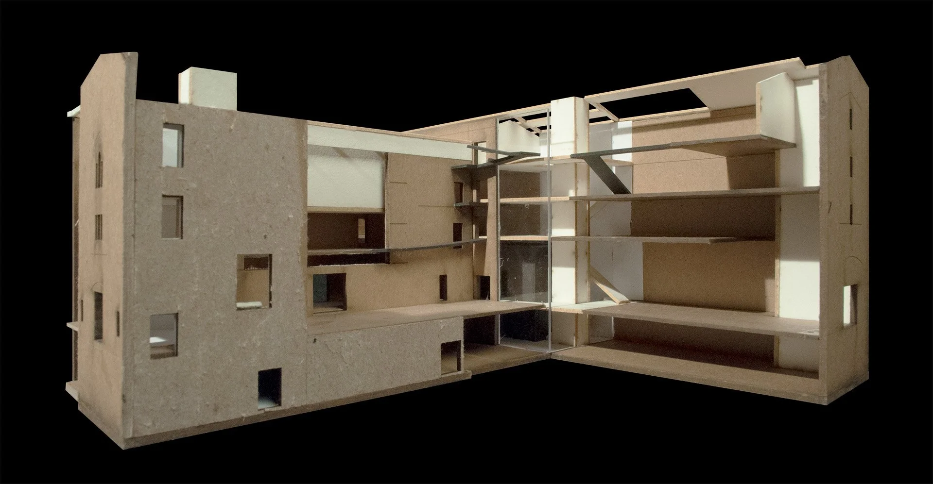
Pull-apart model
1.
2.
3.
![In[form]al](http://images.squarespace-cdn.com/content/v1/62688927ef46ac64011f859d/0609bbb6-516e-420a-a5b7-728a57c1c6a2/Site+Logo.png?format=1500w)


